Nothing existed yet, and now it finally looks like home.
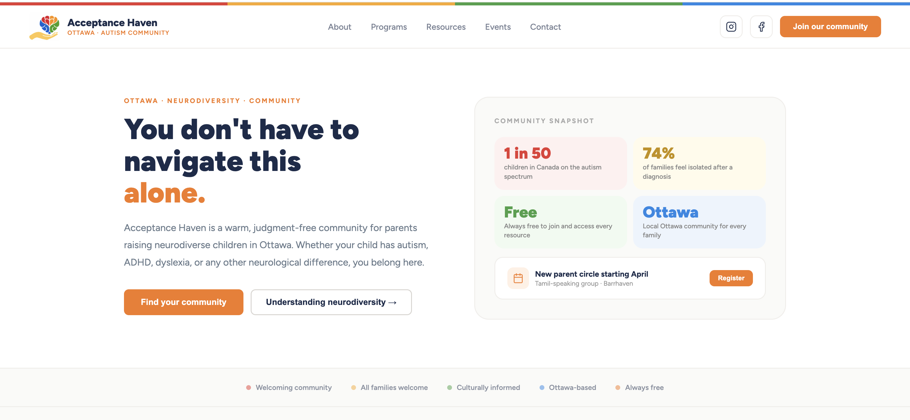
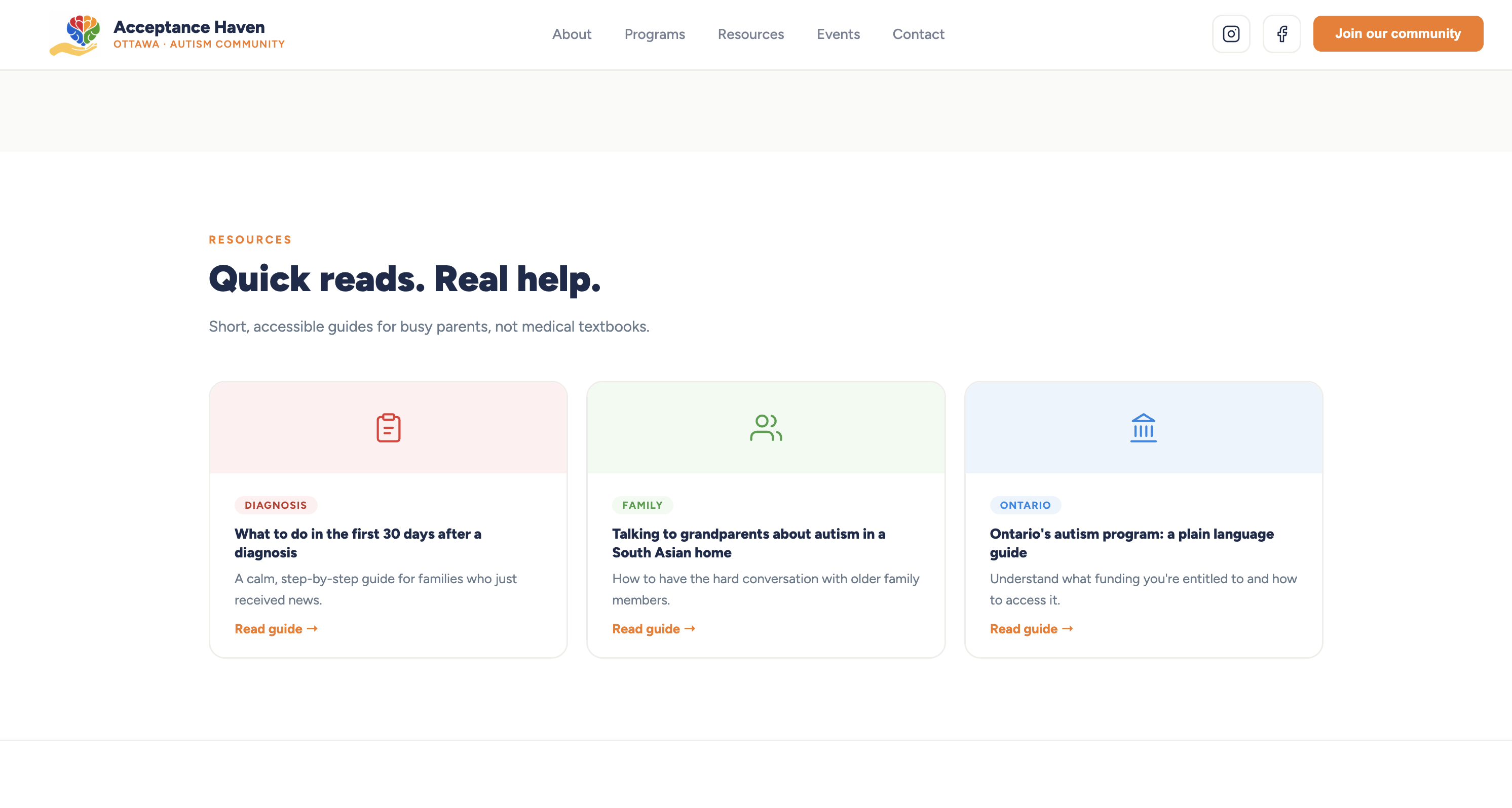
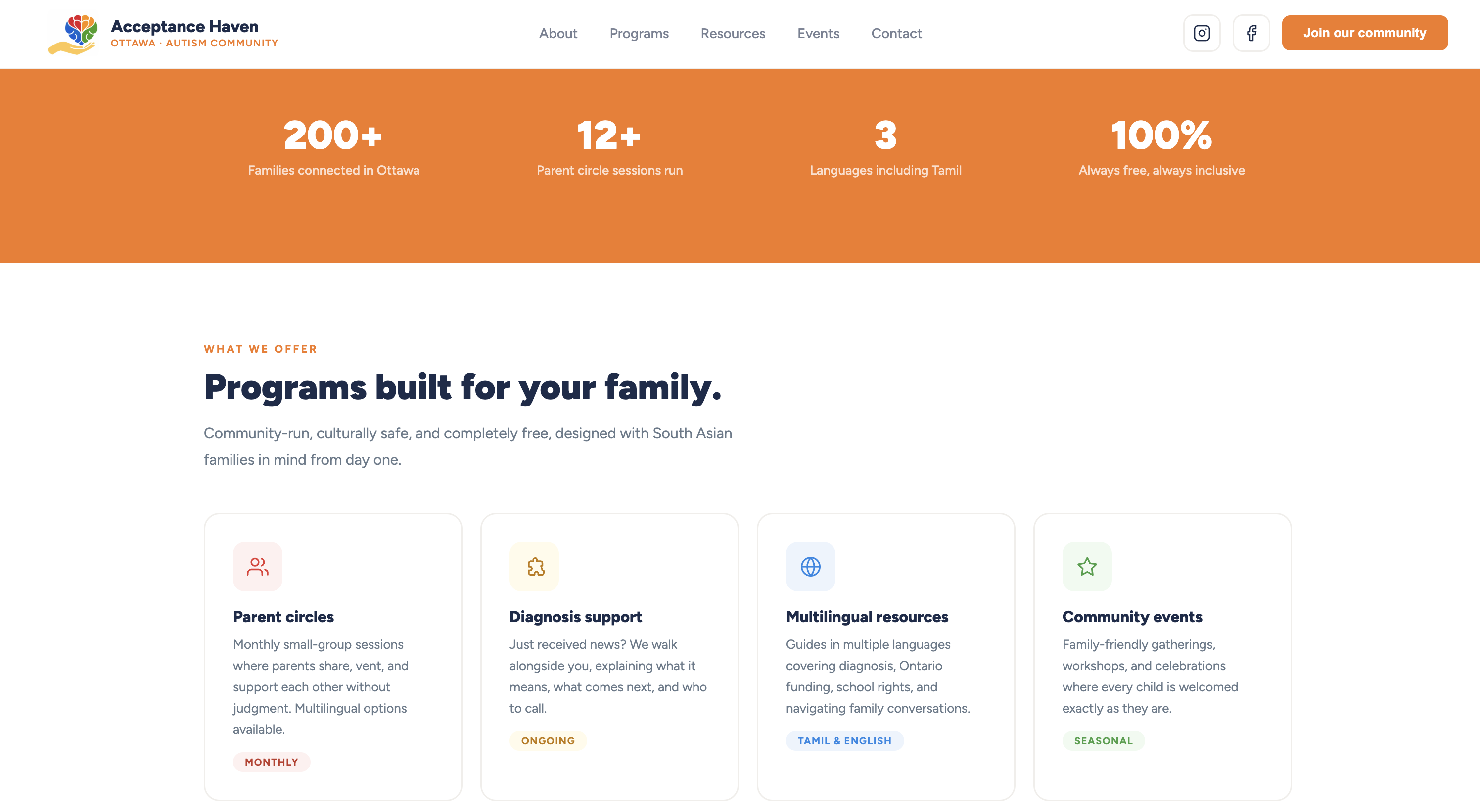
Acceptance Haven is the brand identity, website, and content system I designed solo, from scratch, over a few weeks for an Ottawa nonprofit supporting South Asian families raising neurodiverse children, building the logo, the visual identity, and the site itself before a single family could find them online.
The problem
A mission with nowhere to point people.
Acceptance Haven existed as an idea before it existed as anything visible: no logo, no site, nothing a family could search for or land on. And the families it was built for were dealing with three things at once: isolation after a diagnosis (1 in 50 children in Canada are on the autism spectrum, and 74% of families report feeling isolated afterward), generic disability resources that weren’t built for their cultural context, and a language gap most “multilingual” sites solve by just running English through translation instead of writing for the culture directly.
None of that could be solved with words alone. Everything needed to feel warm and specific before it said a single thing about programs or diagnosis support: the logo, the color system, the way the homepage opens, all built so “you belong here” would land before the copy even loaded.
Process
The system
What I’d do differently
I designed the logo and brand mostly alone, without putting early concepts in front of anyone from the actual community. I’d want at least a couple of South Asian or Tamil parents to react to the mark before calling it final next time.