← All work
Brand & web design · 2025

A generic template, replaced by a practice that finally feels like her.

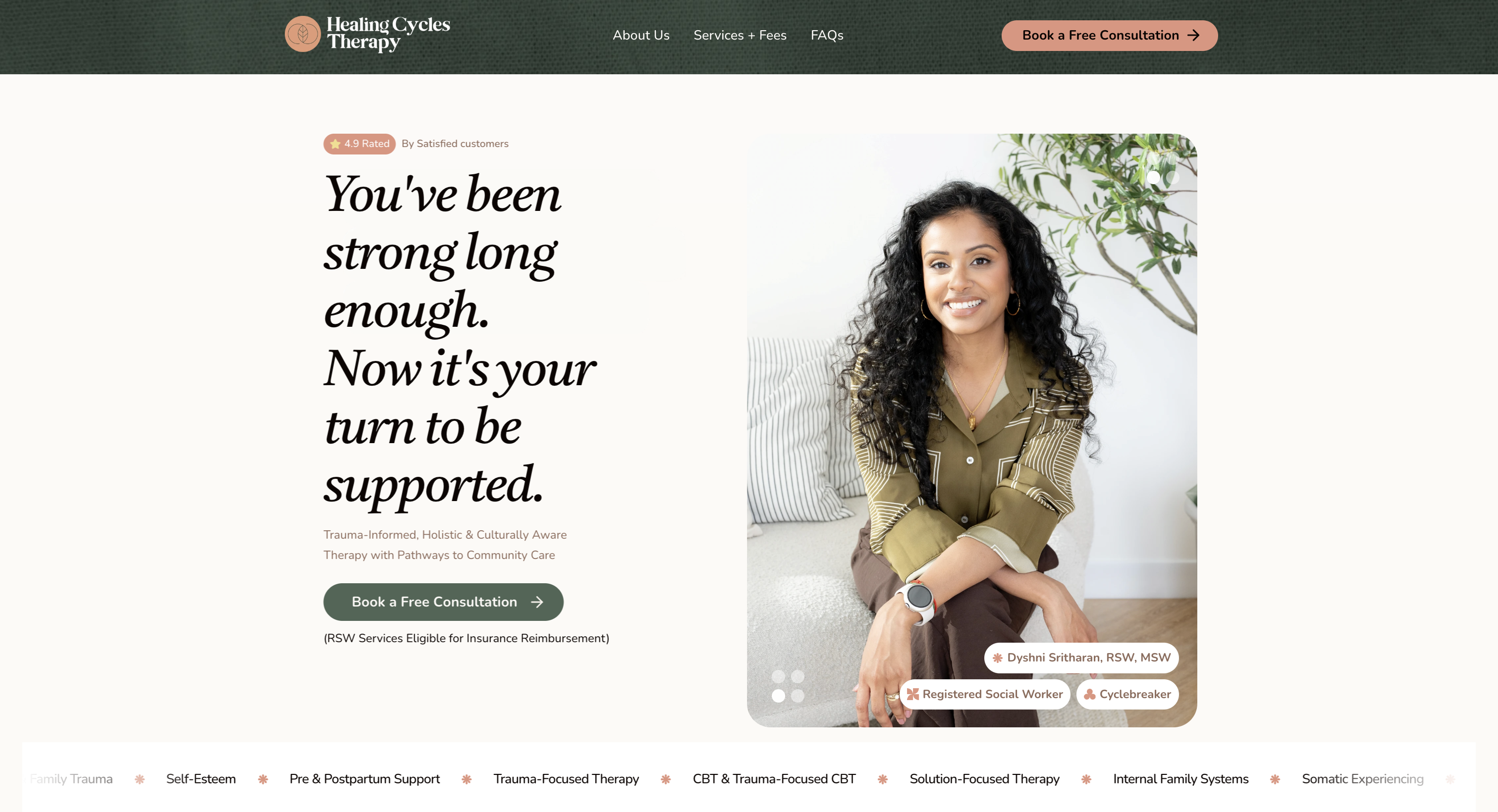
Healing Cycles Therapy is the brand identity, website, and messaging system built over a few weeks for Dyshni Sritharan, a Toronto-based Registered Social Worker, replacing a generic, clinical-feeling site with one that speaks directly to the women she actually treats.
{{ m.label }}
{{ m.value }}
Healing Cycles Therapy homepage
01

The problem

A clinical-sounding site, for a practice that’s anything but.

The existing site was generic and slightly cold, the kind of DIY template that could belong to any practice, at a moment when the people Dyshni most needed to reach had to feel specifically seen, not processed. Culturally-attuned, trauma-informed care doesn’t land if the first impression reads like a waiting room.

Her actual audience is specific: women who’ve “been strong long enough”: carrying anxiety in their bodies, overthinking but still stuck, aware of their patterns but not experiencing real change. The old site never said that out loud. It just implied “therapy,” generically.

There was a second, quieter problem underneath: Dyshni’s practice draws on a wide range of specific approaches (CBT, Internal Family Systems, Somatic Experiencing, Narrative Therapy, attachment-based work), a credibility asset, but also easy to bury someone in jargon. The site had to hold both: feel warm on first read, and still list the credentials (RSW, MSW) that make it trustworthy.

{{ c.value }}
{{ c.label }}
02

Process

{{ s.step }}
{{ s.title }}
{{ s.body }}
03

The system

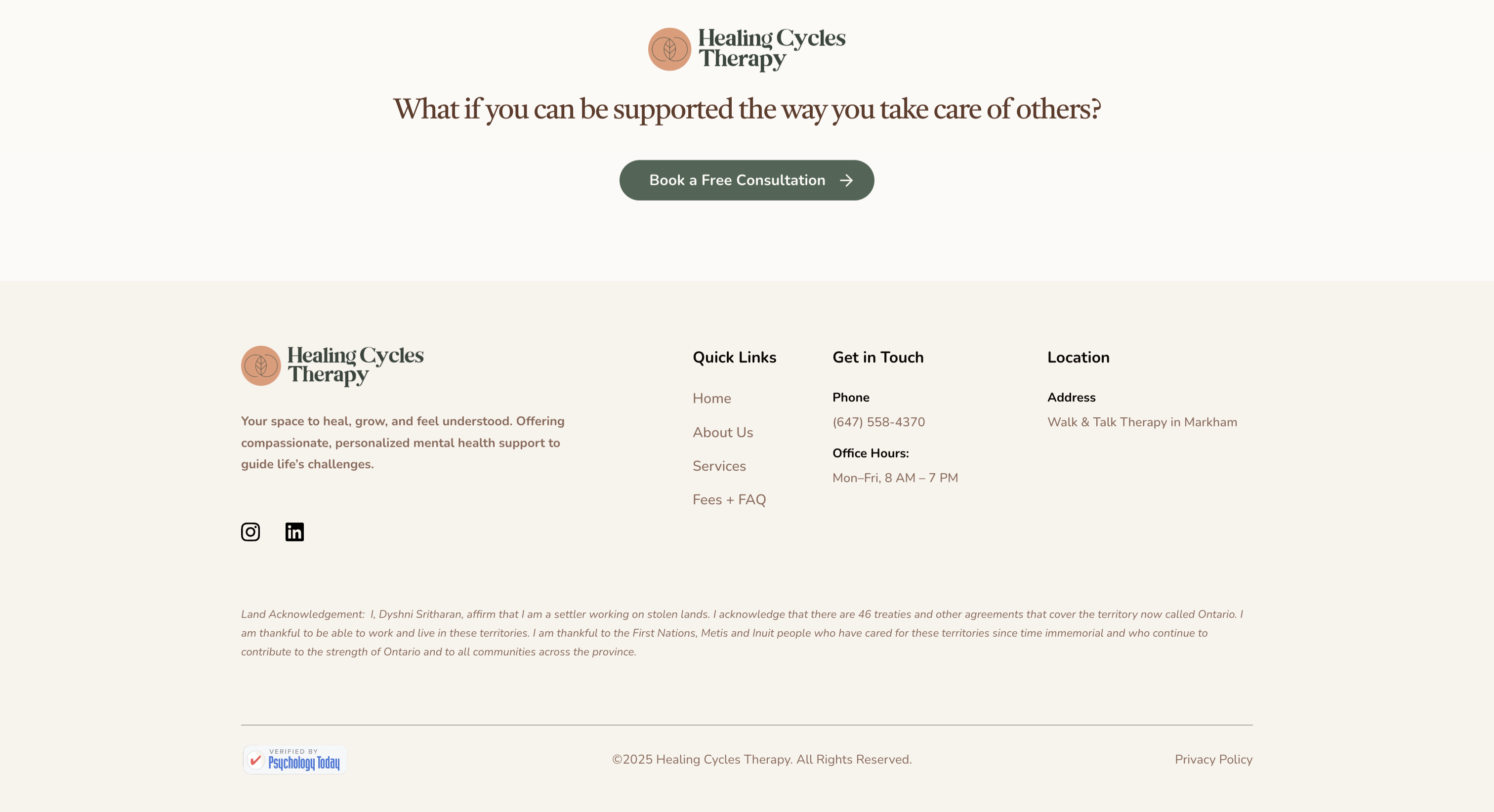
Brand identity
Brand identity
A soft literary serif for headlines, an earthy terracotta-and-sage palette against warm off-white, built to feel warm without losing credibility.
Homepage
Homepage
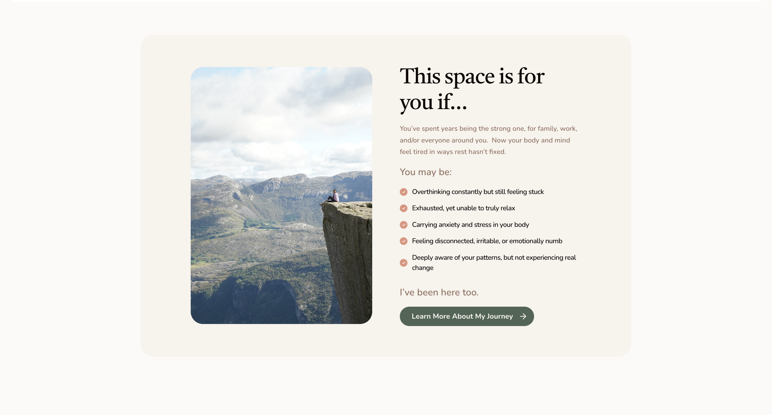
The first impression leads with permission, not a service list. A “this space is for you if…” section names specific, felt states so a visitor sees herself before she sees a service.
Services and specialties
Services & specialties
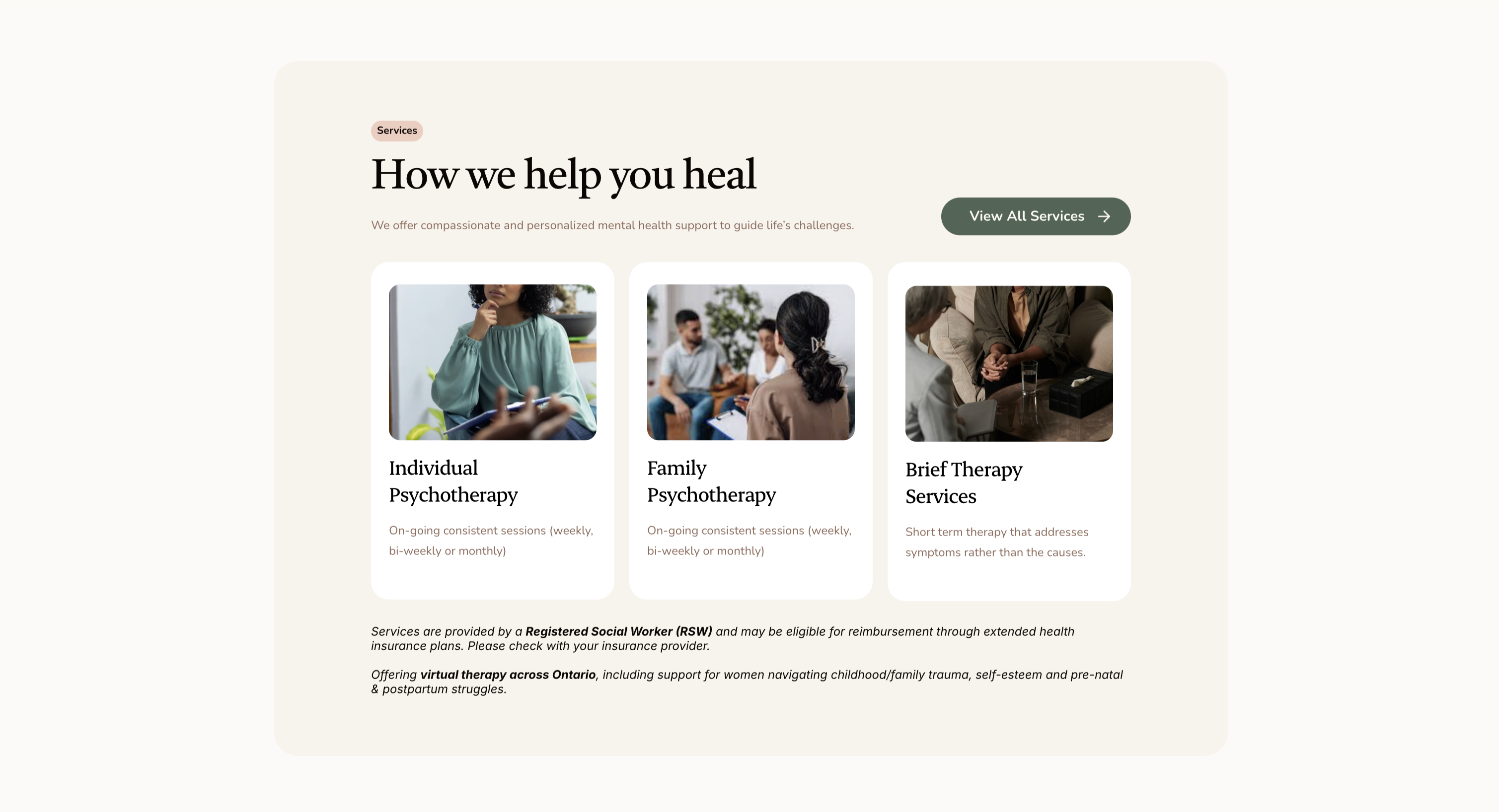
Individual, family, and community care, plus every clinical modality (CBT, IFS, Somatic Experiencing, and more) shown as scannable tags instead of a paragraph of clinical explanation.
Booking flow
Booking flow
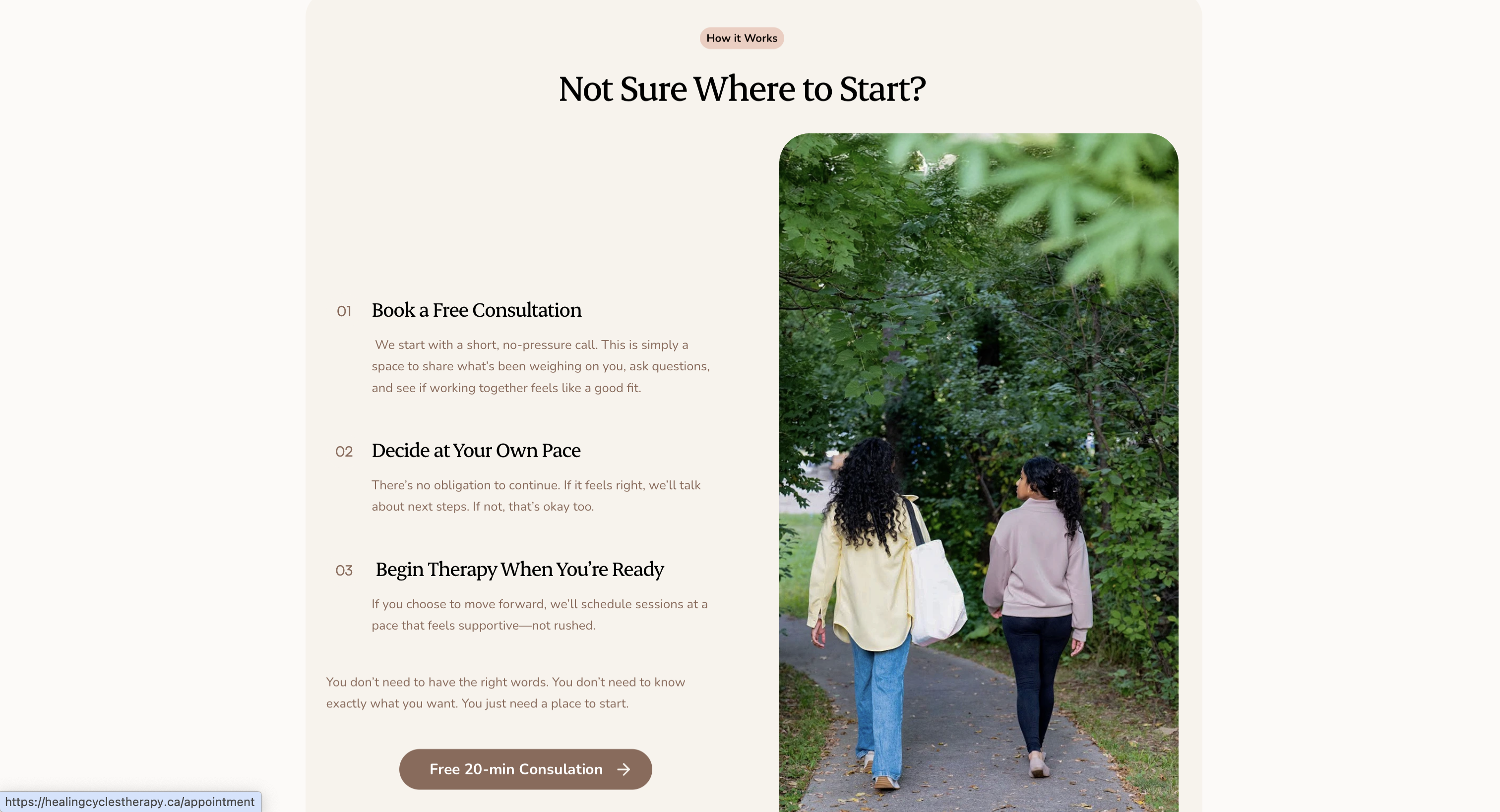
A clear, low-pressure 3-step path: book a free 20-minute consultation, decide at your own pace, begin when ready, paired with “you don’t need to have the right words, you just need a place to start.”
Typography & color
Aa
Castoro, a soft literary serif, carries headlines like “you’ve been strong long enough.” Nothing about it reads clinical or cold, which is the whole point.
Color
Terracotta and sage against a warm off-white, not stark white: earthy and grounded rather than sterile, holding the same “warm, not soft; credible, not cold” balance as the copy.
04 Outcome

A site that reads less like a directory listing and more like the practice itself: warm, specific, and unmistakably built for the woman it’s for.

{{ d }}
Client testimonial

“Working with Dyshni has been profoundly healing and transformative. She creates a space where I always felt safe to explore my thoughts, emotions, and vulnerabilities without judgment.”

Client, Individual Psychotherapy
05

What I’d do differently

Naming the audience as specifically as I did was the right call, but I made that decision almost entirely on instinct. Next time I’d actually talk to two or three women in that audience rather than design toward an assumption of what would resonate.

Previous Meducine Next Acceptance Haven
Want the long version?
Happy to walk through the identity, the messaging, and the build.
hello@aingeli.com ↗