← All work
Product design · 2026

One prototype, one week, and a health app people actually come back to.

Meducine is the health-education app I redesigned solo, in one intensive week, for my co-founder’s startup, rebuilding a bare-bones FlutterFlow prototype into a doctor-verified, gamified learning experience now used by 12,000+ learners across 150+ languages.
{{ m.label }}
{{ m.value }}
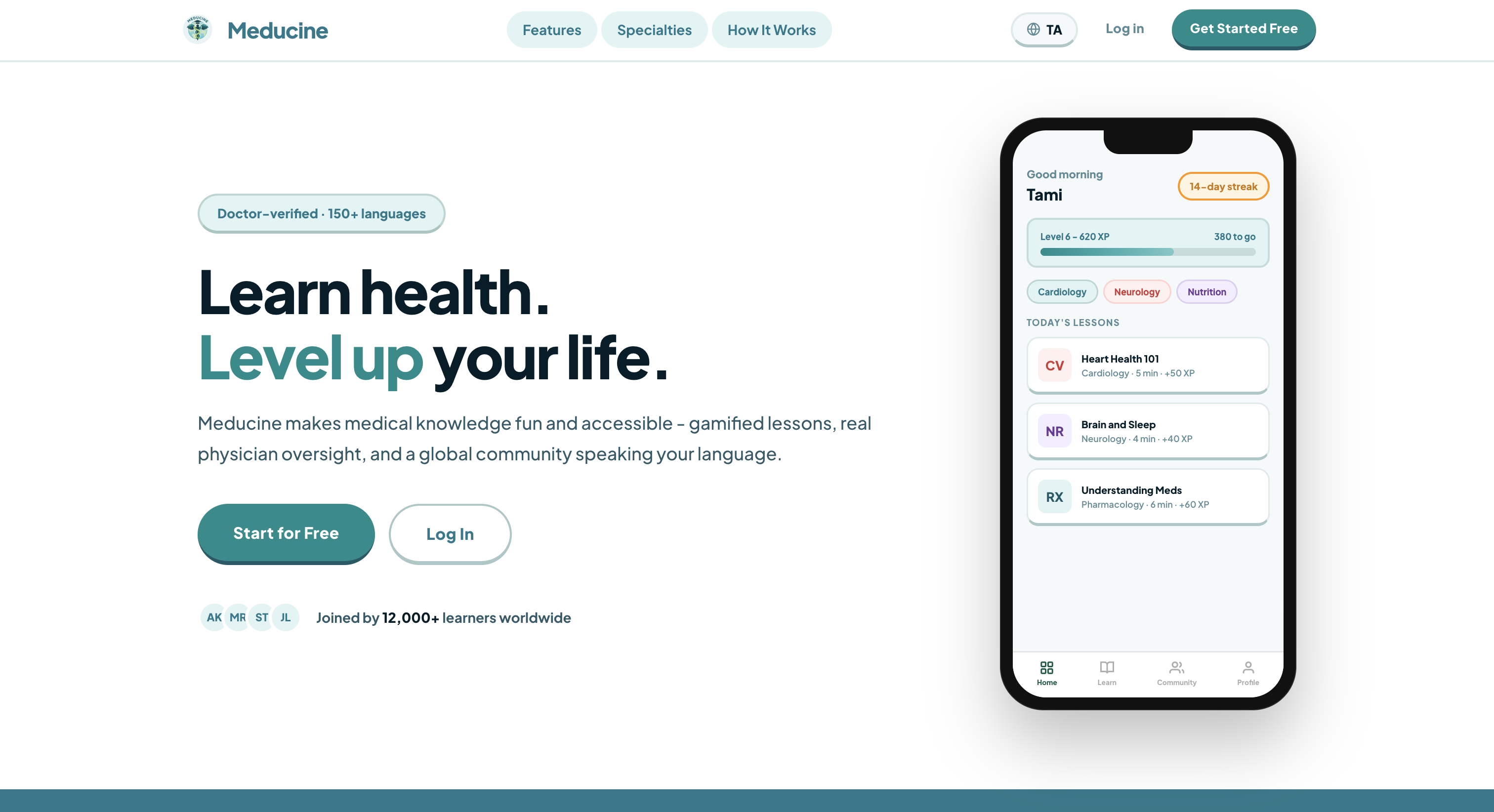
Meducine landing page
01

The problem

Written for clinicians, understood by no one else.

Most health information is written by clinicians, for clinicians: dense, jargon-heavy, and built for a system, not a person trying to understand their own body. For the millions of people who don’t speak the language medicine defaults to, that gap isn’t an inconvenience, it’s a wall.

The scope of what needed covering was enormous: 26 medical specialties, from cardiology and neurology to genetics and infectious disease, each with its own vocabulary and its own way of intimidating a first-time reader. Flattening all of that into something a non-clinician could pick up in a five-minute lesson, without stripping out the accuracy that makes it trustworthy, was the real design problem, not just making it look nicer.

The starting point was a bare-bones FlutterFlow prototype, a shell of an idea and not yet a product. There was no visual system, no content structure, and no mechanism to make a habit out of something people otherwise avoid. The job was to turn it into something people would trust with their health, and actually come back to.

{{ c.value }}
{{ c.label }}
02

Process

{{ s.step }}
{{ s.title }}
{{ s.body }}
03

The system

Onboarding
Onboarding
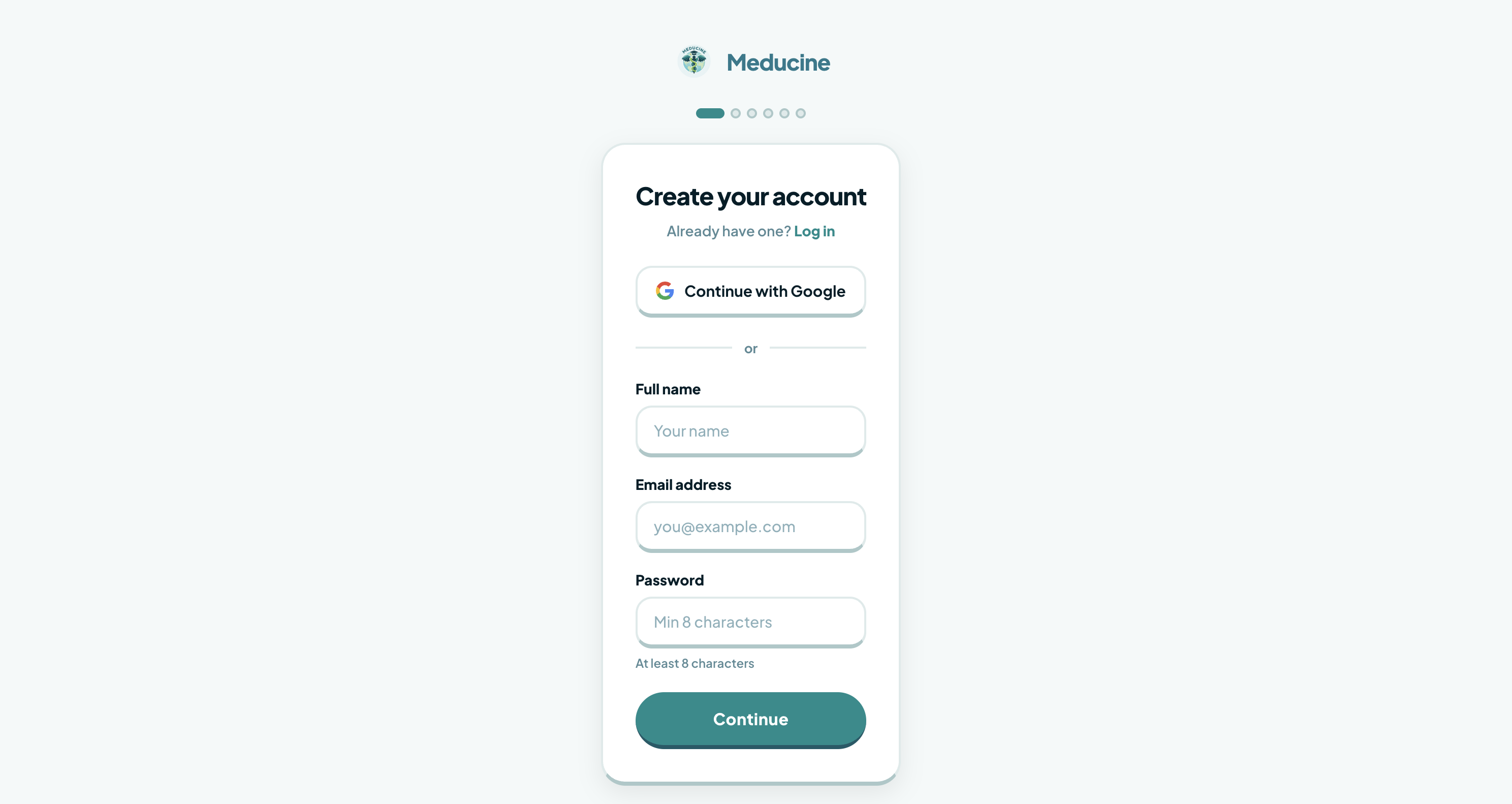
Select specialties, get a personalized starting path. The app shapes day-one lessons around what a learner actually said they cared about, not a generic curriculum.
Gamification engine
Gamification engine
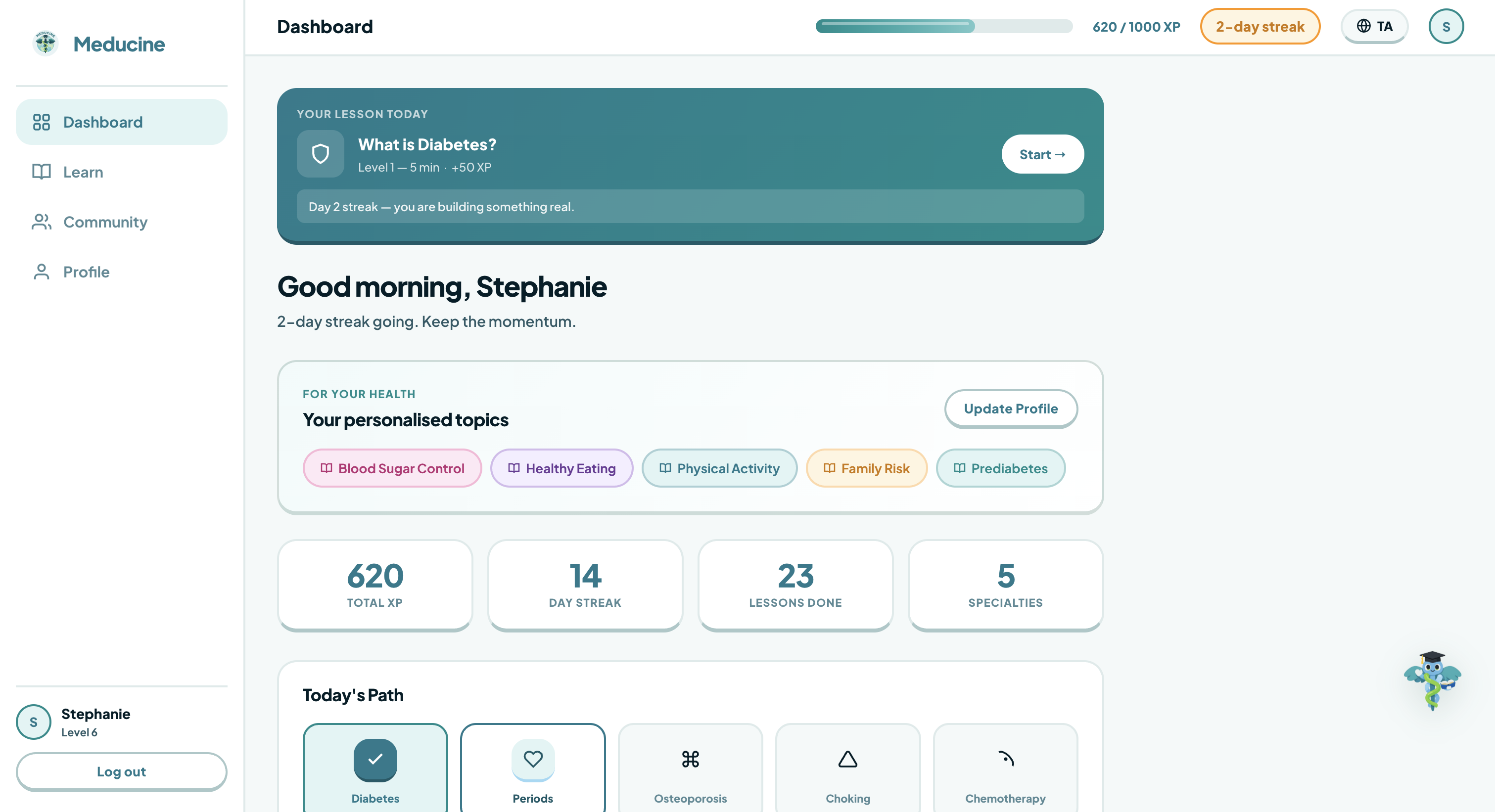
A visible streak counter, a level and XP bar showing exactly how much stands between a learner and the next level, and a running list of that day's lessons, each tagged with its specialty, time cost, and XP reward, tied to comprehension, not clicks.
Content library
Content library
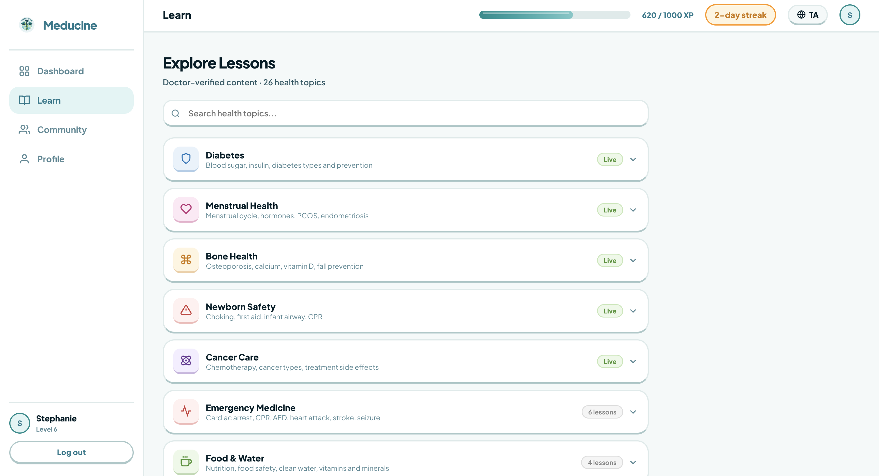
26 specialties, each with its own color-coded tag so a learner can scan what field a lesson belongs to before reading a word. Browsable by search or category, each broken into short, doctor-verified lessons.
Language system
Language system
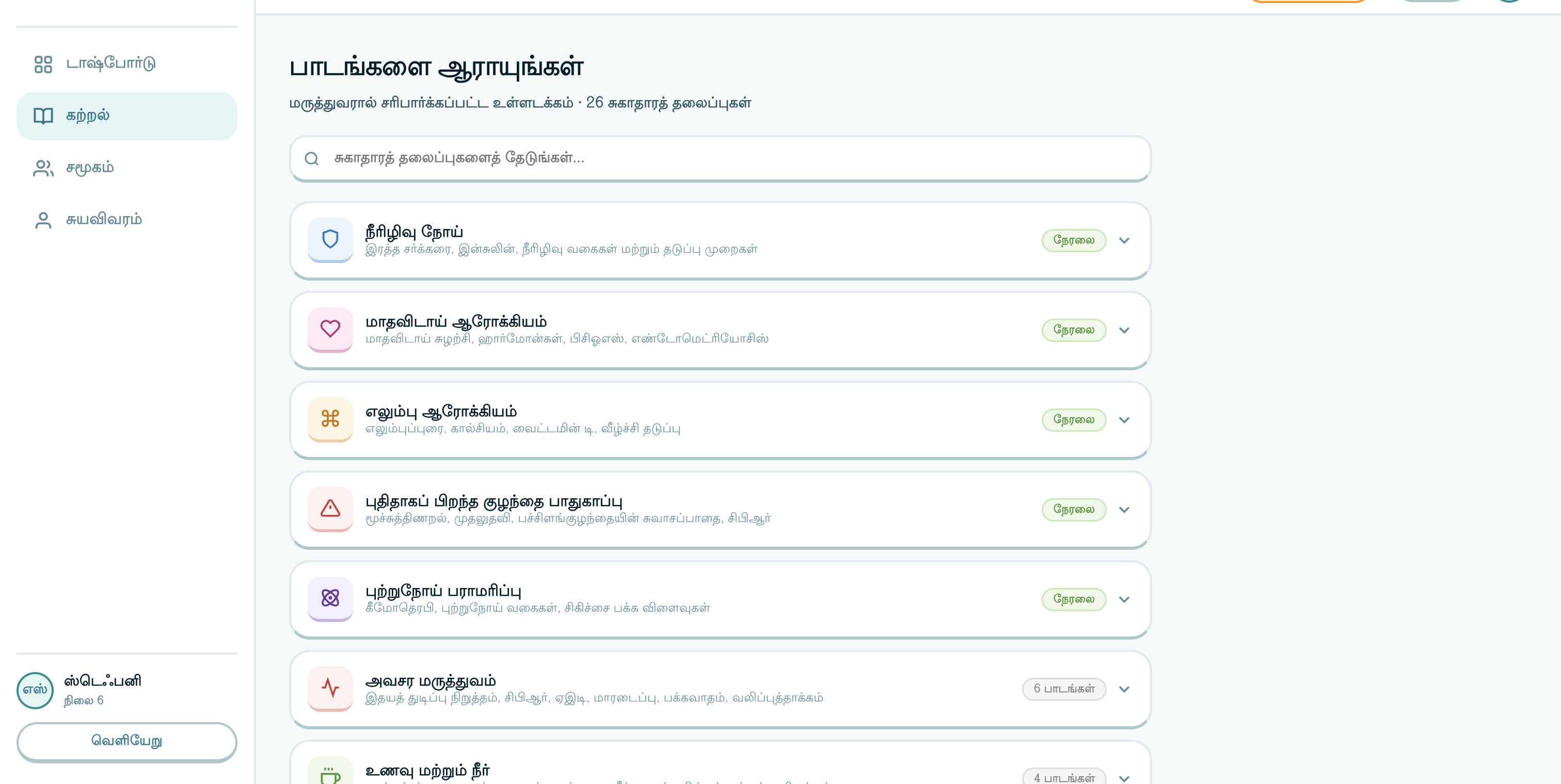
A language switcher sits in the top nav, not buried in settings. One layout built to hold up whether a sentence runs long or short across 150+ languages, without hard-coding for English line lengths.
Typography & voice
Aa
The interface runs on Plus Jakarta Sans end to end: extra-bold on every headline for a punchy, confident tone, stepping down to a lighter weight for explanatory copy. Rounded and geometric: friendly enough not to feel clinical, structured enough to sit next to a doctor-verified badge.
Color & specialty tagging
A teal-forward palette that reads as “health” without defaulting to sterile medical blue-and-white. Each of the 26 specialties gets its own color-coded pill badge, rounded, with a pastel background and bold saturated text, so a learner scanning their lesson list can tell what field it belongs to at a glance.
04 Outcome
{{ r.value }}
{{ r.label }}
Winner 2026

Winner, HSIL Hackathon 2026, Building High-Value Health Systems: Leveraging AI. Judged by Harvard’s Health Information Systems Lab and recognized as the strongest product in the competition, solving a real problem.

All 26 specialties 100% doctor-verified
05

What I’d do differently

One week solo meant almost no time to test the gamification mechanics with real users before shipping. If I did it again, I’d carve out even one day for that.

Previous AAA Citylink Next Healing Cycles Therapy
Want the long version?
Happy to walk through the week, the mechanics, and what shipped.
hello@aingeli.com ↗